
Colour Temperature and CRI Explained
Neither is complicated once separated from the other, but they're routinely confused, and getting either wrong is one of the more common reasons a technically compliant installation still disappoints on site.

A fixture can hit every lux target on the schedule and still feel wrong the moment it's switched on — too clinical for a reception area, too warm for a workshop, too washed-out for a shop floor where accurate colour matters. Two figures on the datasheet are usually behind that mismatch: colour temperature and CRI.
Colour temperature — what “warm” and “cool” actually mean
Colour temperature is measured in kelvin (K) and describes the apparent warmth or coolness of white light, not its brightness. Lower values — 2700K to 3000K — read as warm white, similar to traditional incandescent or halogen lighting, and suit spaces meant to feel relaxed or residential: hospitality, reception areas, some retail. Mid-range values — 3500K to 4000K — read as neutral white, the common default for offices, retail, and general commercial space, balancing a professional feel without the clinical edge of daylight tones. Higher values — 5000K to 6500K — read as cool or daylight white, associated with alertness and detail work, and are a common choice for warehouses, workshops, and industrial environments where visual clarity matters more than ambience.
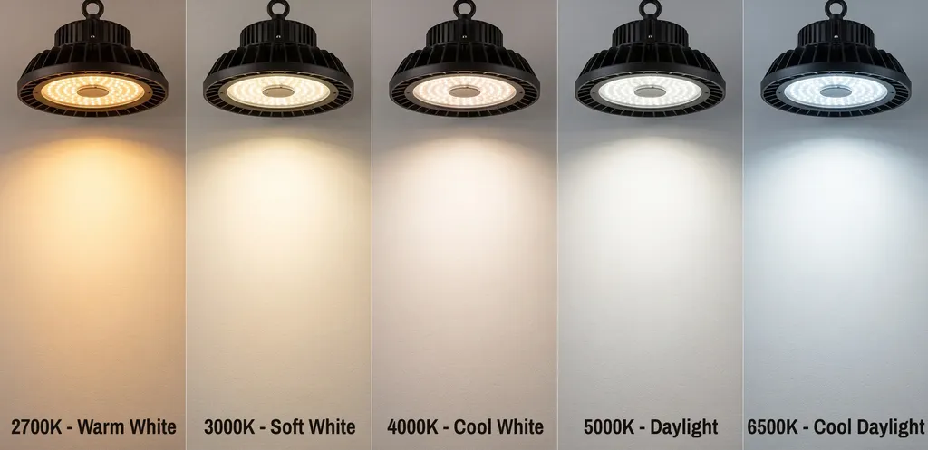
CRI — how honestly a light source renders colour
Colour Rendering Index (CRI, sometimes shown as Ra) is a separate measurement, on a scale up to 100, of how accurately a light source reveals the true colours of what it's illuminating, compared with a reference light source at the same colour temperature. Two fixtures can share an identical colour temperature — both a clean 4000K, say — and still render colour very differently: one with a CRI of 95 shows fabrics, produce, or finished products close to how they'd appear in good daylight; one with a CRI of 70 can leave the same items looking slightly flat, dull, or subtly the wrong shade, even though the “whiteness” of the light itself looks fine to the eye. Colour temperature is about warmth; CRI is about honesty.

Where each one actually matters
- Retail and showroom: CRI 90+ is generally worth specifying wherever colour accuracy affects a purchase decision — clothing, paint, food.
- Offices and general commercial: 3500–4000K with CRI 80+ covers most day-to-day needs without unnecessary cost.
- Warehousing and industrial: 4000–5000K is common for alertness and task visibility; CRI 70–80 is usually adequate unless colour-coded stock or safety marking is involved, in which case CRI 80+ is worth the modest premium.
- Hospitality and residential-feel spaces: 2700–3000K, generally paired with CRI 80+ so skin tones and furnishings render naturally.
- Healthcare and inspection tasks: CRI 90+ is frequently a genuine functional requirement, not a preference, because accurate colour perception can be part of the task itself.
A specifying habit worth adopting
The easiest mistake to avoid is treating colour temperature as a proxy for quality — assuming a cooler, “brighter-looking” white is automatically the better choice. It isn't; it's simply a different visual character, appropriate to some tasks and wrong for others. The more useful habit is to separate the two questions entirely: decide the colour temperature based on how the space should feel and what task it supports, then decide the CRI based on how much colour accuracy that task genuinely requires — and specify both explicitly, rather than letting “warm white” or “daylight” stand in for a full answer.
Colour temperature decides how a space feels. CRI decides how honestly it shows you what's actually there. They're answering two different questions, and a specification should answer both.
Neither figure is difficult to specify correctly once they're treated as separate decisions. The projects that go wrong are usually the ones where colour temperature was chosen on instinct and CRI wasn't asked about at all — a gap that rarely shows up on a lux meter, but shows up immediately to anyone standing in the finished space.